Conceptua Product Redesign
UI/UX
Visual Design
Conceptua Product Redesign
Overview
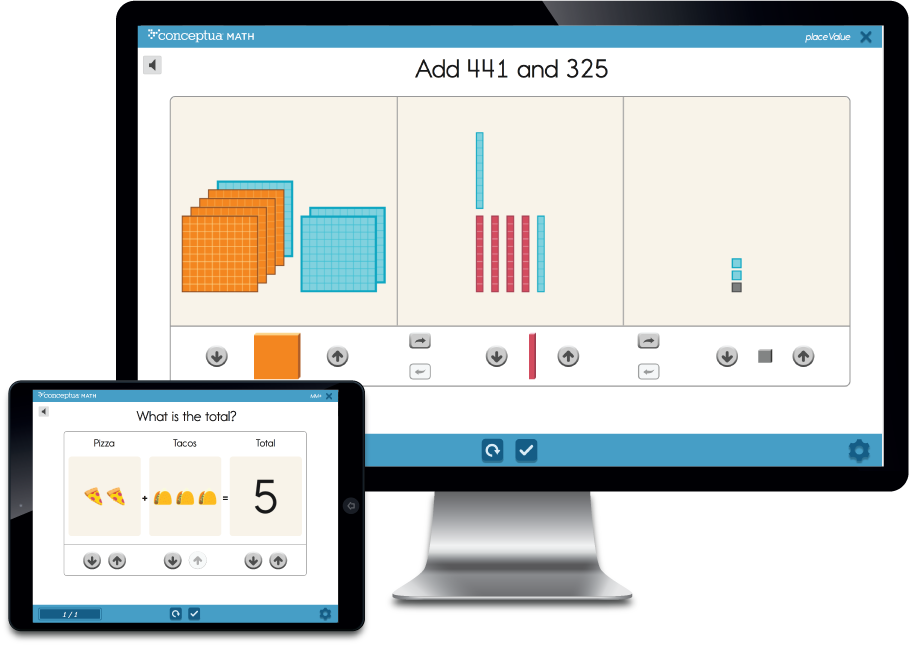
Conceptua Math is an elementary math curriculum product for grades 3 - 5 that is built upon digital, interactive math models. The result of this work was the creation of a new, modernized and intuitive K-2 educational experience, and increased revenue streams for the company.
Problem
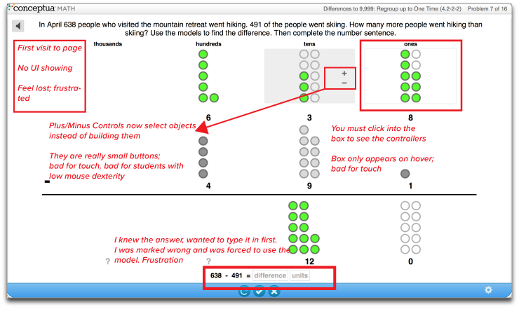
In the education space, a product focusing on grades 3 - 5 has a limited value proposition for school districts, and as a result, Conceptua Math was losing out to publishers that could offer more. Furthermore, the existing product was suffering from an outdated and unfriendly interface - UI was hidden and often inconsistent, feedback was text-based and confusing, and the user was required to watch tutorial videos to interact with the tools successfully.
My Role
As the lead designer, I was involved in the entire product lifecycle from ideation to launch. In collaboration with stakeholders on the content, product, engineering, and QA teams the project outlined below was completed in a 10-month time frame.
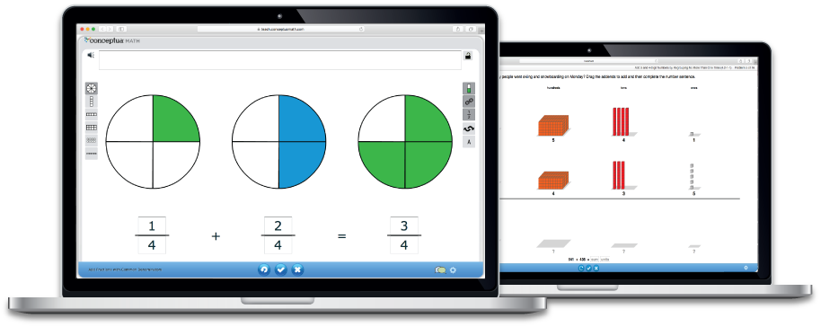
Screens of the original Conceptua UI
Research
The discovery phase of the project focused on three main elements: research into the K-2 student, an audit into interaction patterns and overall experience of the 3-5 product, engaging with the content.
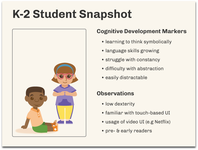
01 | Understanding the K-2 Student
To understand the target audience, I began user research starting with a literature review of books focused on cognitive development in children and designing for different age groups of children. Since access to students can be tricky, I observed my friends' children when possible and talked to other parents as well.
02 | UI/UX AUDIT OF EXISTING PRODUCT
The K-2 product would serve as the foundational experience for students who graduated through the grade levels with Conceptua Math. I performed an audit of the existing 3-5 product to identify the common interaction patterns and to gain empathy for the user.
03 | Engaging with content
The content team assembled high-level documentation of the curriculum requirements and grade-level constraints. We also played with the commonly used, physical math models for the K-2 classroom. In these explorations, I focused on how objects physically behaved (e.g. did they snap together), how they were organized visually during instruction and the alignment between models and the content they are used to teach.

Research Insights
Six actionable findings the research phase
We took insights from the research phase to develop a set of design principles that would carry with us throughout the design and development cycles.
- Tool tutorials & instructions are a thing of the past
- Don't rely on text for anything
- Buttons should be big and have increased affordance
- Kids are going to touch first
- Extraneous functionality is distracting
Design
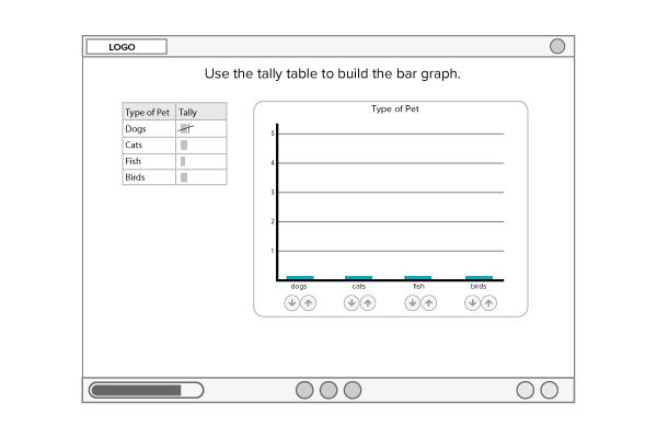
After absorbing all of the information provided by research, subject matter experts, and hands-on exploration, I began to sketch possible tools for the K-2 curriculum. I focused first on the pedagogical needs of the tools and then I turned my attention to refining the interaction patterns, feedback mechanisms, and the overall look and feel.
Covering the Content
I used sketches to rapidly generate ideas and nail down the essential components of the K-2 tool library. From the drawings, we were able to identify shared functionalities and began to organize the interactions into possible tools and modes.
Layout and Dimension
After capturing the major tool needs in sketches, I moved on to creating lo-fi wireframes in the Sketch App. In the wireframe phase, common visual themes emerged as did the overall layout and dimension for the K-2 tool library.
Insights from Lo-Fi Iterations
Four essential distillations from lo-fi work
We took insights from the lo-fi phase to identify common interactions, develop a design system that could be applied across all tools, and hone in on essential functionality. The reasoning behind the insights are as follows:
- To focus students' attention, we chose a bin layout and removed side rail buttons (contrasting existing product designs).
- To reduce cognitive load, we chose up and down arrows as our icons, and we applied them across the tools as much as possible to create consistency.
- To maximize resources, we identified four primary actions that would repeatedly be applied, in different visual forms, across the majority of the tools.
Interactions & Animations
I created Hi-Fi designs in Animate CC such that I could communicate interactions and animations to stakeholders.

Other Considerations
Feedback designs
Each tool needed to include real-time, informative, and visual feedback so that the students could work independently. The feedback from the existing grades 3 - 5 product was text-based, confusing, and used a polarizing emotional color (red).

Correct feedback from grades 3 - 5 (left) and K-2 redesign (right)
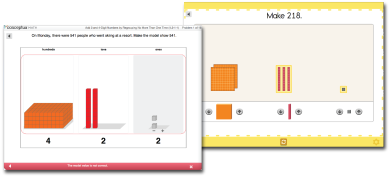
Incorrect feedback from grades 3 - 5 (left) and K-2 redesign (right)
Design decisions
Red color was replaced with yellow for softer emotional effect
Bigger "win" given to correct feedback with a larger visual footprint
Number count overlay (with or without audio) to aid in instruction
Extraneous features of the frame covered over during feedback to increase focus on feedback
Color blocking of feedback on the frame to help teachers see the status of students' work from a distance while walking through the classroom
Look & Feel
For the young, K-2 audience, I wanted to increase the frequency of color usage, introduce characters that they could connect with, and create a frame that would not distract from, or compete with, the learning experiences. Look here for more information on the visual design decisions.
Frame ConsiderationS
Added a progress bar so time-spent on task could be visualized
- Moved Exit button to the upper right corner to align with conventional UI patterns
Used a flat design for the buttons to contrast with 3-d buttons within the tools
Employed monotone color palette to reduce visual noise
Sample image of contextual, word-problem


